A logo that holds up everywhere you use it.
The mark people recognize you by has to work at a favicon's size, stay sharp on any screen, and print clean on a sign. Here's how we design one that does all three, and hand you every file of it.
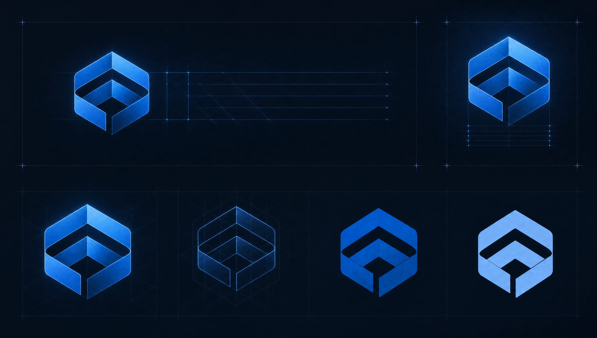
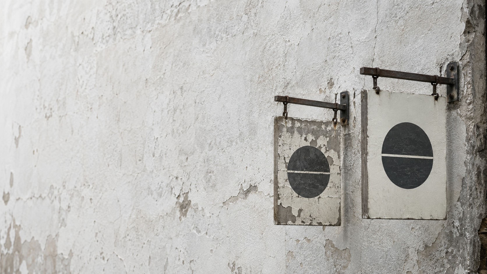
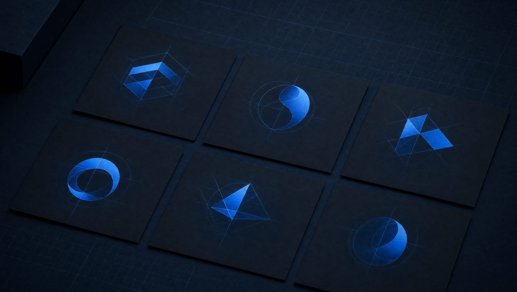
The one mark, shown in every form it takes: full lockup, stacked, symbol, one-color.
First, the mark itself.
When we say "a logo," here's what you should picture: a mark drawn for your business, tested at the sizes you'll actually use it, and delivered as a full set of files you own. Not a shape pulled from a marketplace and recolored. Not one JPG someone exported and called it done. A mark that exists because a person sat down and designed it around your name, your market, and the places it has to live.
Every logo project ends with the same set of things in your hands:
- The primary mark, drawn from your business and your positioning, not from a trend sheet or a template pack.
- The variants you'll actually reach for: horizontal and stacked lockups, a symbol on its own, and a one-color version for when color isn't an option.
- A version for light backgrounds and a version for dark, so the mark reads whether it sits on white, on black, or on a photo.
- The small sizes proven, not assumed: a favicon, a social avatar, an app-style icon, each checked at the pixel dimensions they render at.
- Every file format, vector source plus web and print exports, organized and labeled so the right file is easy to find.
- A short, easy-to-follow usage sheet: clear space, minimum size, the color values, and what not to do to the mark.
What you won't get matters just as much. No stock symbol that forty other companies also bought. No single low-resolution file you have to beg to get replaced. No mystery about which format goes where. The mark carries exactly what your business needs to be recognized, and it arrives ready to drop into your site, your sign, your social profiles, and your inbox signature the same week.
Let's be straight about what a logo can and can't do.
A logo is one asset. A powerful one, but one. It is the visual shorthand for your business, the thing people recognize on a truck door or a browser tab before they read a single word. What it is not is your whole brand. Your brand is the wider system: how you sound, the colors and type that travel across every page, the promise people remember after the call ends.
We tell you this up front because a logo is often sold as if it will, by itself, make you look trustworthy and win you customers. It won't. A mark can make you recognizable and consistent, which is real and worth paying for. But recognition is a foundation, not a finished house. If what you actually need is the full picture, positioning, voice, and a visual system that holds together everywhere you show up, that's brand identity and positioning work, and a logo is one piece of it.
Here's the useful part of that honesty: it tells you when a logo is enough on its own and when it isn't. If you have a clear sense of who you are and just need a mark that finally works everywhere, a logo project is exactly right. If you're still figuring out what you sound like and what sets you apart, the logo comes second, after the branding, so it's drawn to fit something instead of guessing.
You already know the ways a bad one bites you.
Most businesses don't come to us wanting "a logo." They come because the one they have keeps failing them in specific, annoying ways. See if any of these are yours.
It falls apart at small sizes. The mark looks fine on a business card and turns to mush the moment it's a favicon or a phone-screen icon. Fine detail that reads at three inches disappears at sixteen pixels. If your logo is a smudge in the browser tab, it isn't doing the one job a small mark exists to do.
You only have one file, and it's blurry. Somewhere along the way you got a single JPG, and now every time you scale it up for a banner or a sign it turns fuzzy and boxy, with a white rectangle stuck behind it that won't come off. There's no version with a see-through background, no version that scales cleanly, no source file to fix any of it. This is the one-JPG-and-good-luck problem, and it's the most common one we see.
“A logo you can't resize, recolor, or put on a dark background is a picture of a logo, not a logo.”
It looks like everyone else. The $5 marketplace mark and the AI-generator logo both have the same tell: you've seen them before, because they're assembled from the same pool of stock shapes everyone else is drawing from. A swoosh, a generic house, a gradient globe. It isn't yours in any real sense, and it may not be legally yours to use at all.
It chased a trend and aged in a year. Trend-chasing marks look current for a season and dated by the next. The point of a logo is that people learn to recognize it over years, so a mark built to ride this year's style is a mark you'll be paying to replace before it's had time to work.
The fix for all of these is the same, and it isn't magic. It's a mark designed from your business outward, tested where it will actually be used, and delivered in every format so it never traps you again.
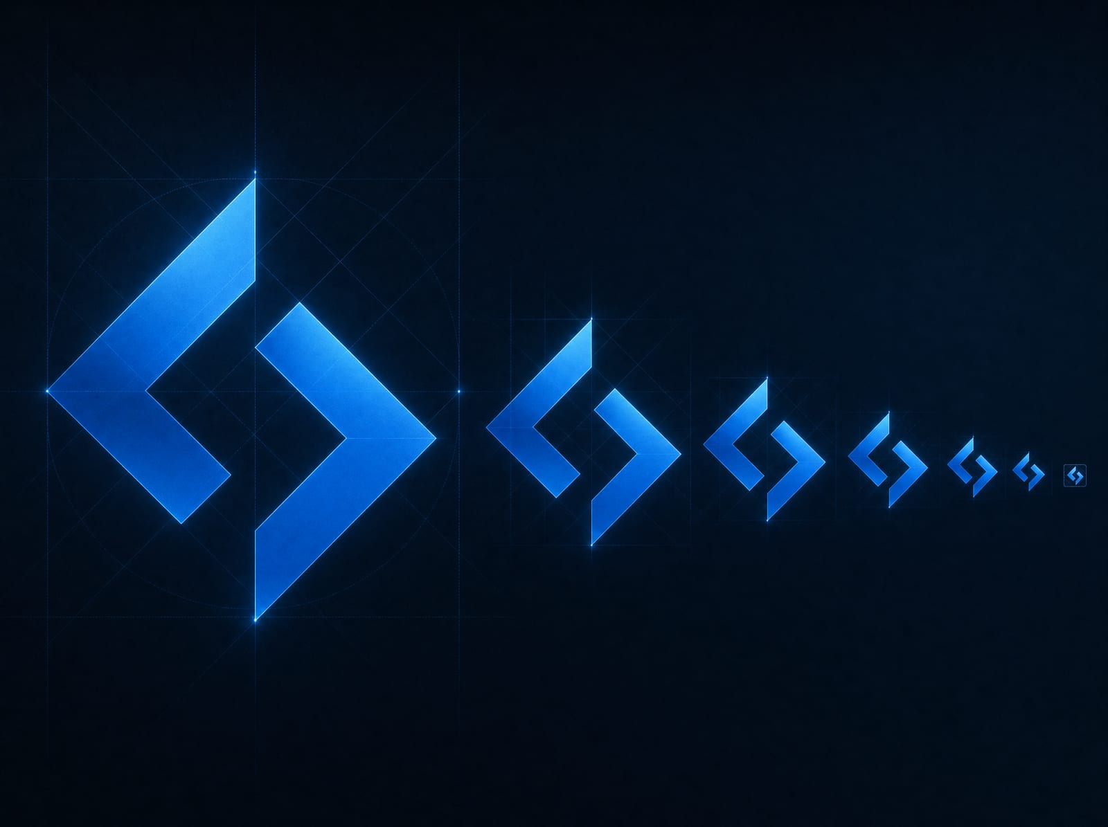
The files leave with you. All of them.
The part that decides everything later is what you actually walk away with. With a marketplace mark or a generator, you usually get a handful of images and nothing underneath them. No editable source. So, the first time you need a change, you're either back in line paying again or living with what you have.
You get the source, not just the pictures. The editable vector files, the ones every other format is exported from, are yours at handover. That's the difference between owning a logo and renting the look of one. With the source in your hands, the mark can be resized to any dimension, recolored, set on any background, and adapted for anything you dream up later, whether you bring it back to us or hire someone else.
Alongside the source, you get the working exports, organized so the right file is obvious:
- Vector source for designers, sign makers, and anyone who needs to scale the mark without limits.
- Web files with transparent backgrounds, sized for your site header, favicon, and social profiles.
- Print files at the resolution and color setup a printer or sign shop expects.
- Light and dark versions so the mark is ready for both themes on your site and both kinds of background out in the world.
- A one-page usage sheet with your exact colors, clear space, and minimum size, so the mark stays consistent no matter who uses it next.
None of this is held back as leverage. There's no vault where your "real" files live that you have to keep paying to reach. Ownership here is the exit door: if you ever move on, everything moves with you, and any designer can pick up the source and keep going the same day. That's the same rule under everything we build, including the website the logo will live on. The door is never locked.
Four steps. You see the work as it happens.
There's no black box here and no dramatic "big reveal." You know which step we're in, what's decided, and what's next, the whole way through. Open each one.
Discovery
We start with your business, not a sketchpad. What you do, who you serve, how you want to come across, and where the mark has to work: your site, a sign, a truck, a phone screen. We look at how others in your field present themselves, so your mark stands apart instead of blending in. Out of this comes a clear direction we agree on before any drawing begins.
Concepts
We design a focused set of real directions, not a pile of random options to overwhelm you. Each concept is a considered answer to your business, shown the way you'll actually use it, small and large, in color and in one color, so you're judging how it performs and not just how it looks in a slide. We walk you through the thinking behind each one.
Refinement
You pick a direction, and we sharpen it. Spacing, proportion, the exact weight of a line, the precise color values. We test it at favicon size and at sign size, on light and on dark, and fix anything that weakens along the way. This is the round where a strong concept becomes a finished, working mark. You mark it up, we revise, until it reads like you and no one else.
Formats and handover
We build out every variant and export every format: vector source, web files, print files, light and dark, favicon and social avatar. You get the organized file set, the one-page usage sheet, and the editable source in your own hands. Handover is the day you own the mark outright, in every format, with nothing held back.
1
A note on timelines: with AI-assisted tooling inside a designer-led process, a focused logo can be ready in days rather than weeks. That is AI as a drafting tool inside custom work, not a generator handing you a stock mark. Prefer we use no AI at all? That is fine, and it runs the traditional few weeks. Either way the honest variable is decisions, yours and ours agreeing on a direction; once it is set, the finishing moves quickly. Bigger identity work, where the logo is one part of a wider system, gets a written timeline in the proposal so you know the shape of it before anything starts.
A logo earns its keep in use, not in a portfolio.
A mark that only looks good framed on a wall has failed the assignment. Yours has to survive the real world, and the real world is mostly small and mostly digital. So, we design for where it will actually appear.
On your website, the logo has to read in the header, shrink to a crisp favicon in the browser tab, and hold up whether the visitor is on your light theme or your dark one. When someone shares your page, the mark rides along in the preview. When they save your site to a phone home screen, it becomes an app-style icon. Each of those is a specific size and a specific background, and we check the mark at every one before we call it done, so it's planned alongside the site it anchors instead of retrofitted after.
Off the screen, the same mark has to work on a sign, a shirt, a vehicle, an invoice. That's why the one-color version and the print files aren't afterthoughts. A logo that needs full color and a white background to look right is a logo that fails half the places you'll want to put it.
“Design the mark for the favicon and the sign, and everything in between takes care of itself.”
And because the mark is the first thing people recognize when you show up in a feed, it has to hold together with how you post and present. A consistent avatar across your profiles is a small thing that builds recognition, which is part of why the logo and your ongoing social presence should be planned to match rather than clash.
Ready when you are. Your work, actually yours.
Tell us about your business and what this needs to cause. You'll have a plan back within one business day, including when the answer is that you do not need this.
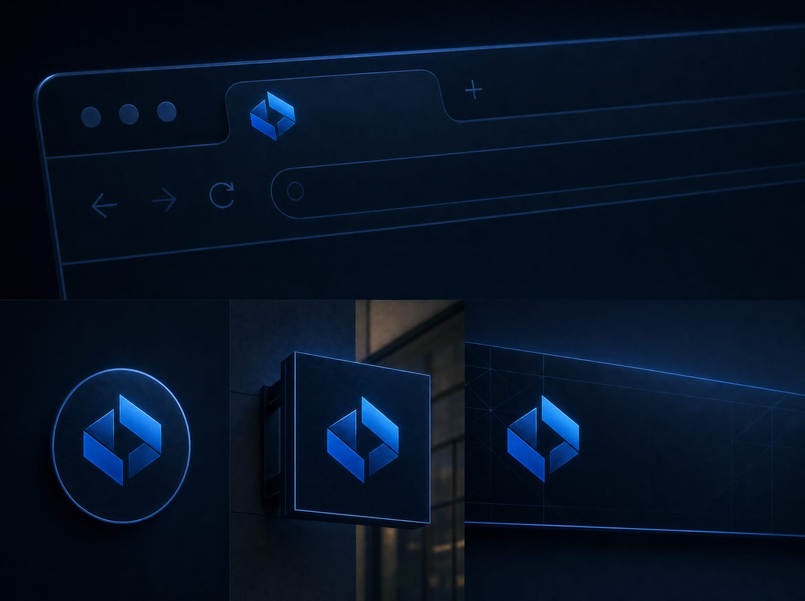
Tell us your caseThe finished mark shown where it lives: a browser tab, a social avatar, a sign, a header.
Asked and answered, before the call.
What does it cost?
Logo design is quoted per project, a setup fee and a flat number you see before we begin, sized to the scope: a single mark and its formats sits at one level, a fuller identity with the logo as one piece sits higher. No hourly meter and no surprise line items. If a template or a $5 marketplace mark fits your budget and your needs, we'll tell you so honestly; custom earns its keep when the mark is how customers recognize and remember you.
Get Logo Design priced for your businessWill I own the logo and get the source files?
Yes, all of it. At handover you receive the editable vector source plus every export, and the ownership is real and written down. Nothing is held back to keep you coming back. If you ever move on, every file moves with you and any designer can pick it up the same day.
Ask who owns what on Logo DesignHow many concepts and revisions do I get?
A focused set of real directions rather than a dozen random options, and revision rounds to refine the one you choose. The exact numbers are in your proposal, clearly stated, before we start. Our aim is a strong, considered mark, not the largest possible pile of choices, which usually just makes the decision harder.
Ask us about Logo DesignHow long does it take?
Faster than most people expect. With AI-assisted tooling inside a designer-led process, a focused mark can be ready in days, not weeks. To be clear, that means AI as a drafting tool inside custom work, not an AI generator spitting out a stock logo; the direction, the judgment, and the final mark are ours and yours. If you would rather we use no AI at all in the process, that is completely fine, and it takes longer, usually the traditional few weeks. Either way the real variable is how quickly directions get decided: when feedback comes back promptly, the work moves promptly. Larger identity projects get a written timeline in the proposal.
Ask how long Logo Design takesDo you check trademarks?
We do a basic similarity review so we're not handing you something that obviously clashes with a competitor, and we'll flag anything that concerns us. But real legal clearance and trademark registration are a lawyer's job, not a designer's. We draw that line up front so you know exactly what is and isn't covered.
Talk Logo Design through with usCan you also handle my website and branding?
Yes. A logo often lands best as part of a bigger picture. We can build the website the mark anchors, and if you need the full system of voice, color, and positioning around it, that's our branding work. The logo can start on its own and connect to the rest whenever you're ready.
Tell us what you need from Logo DesignIf your logo goes fuzzy at small sizes, or you're holding one file you can't do anything with, send us the file you have. We'll tell you whether it needs redrawing or only rebuilding into the formats you're missing.