
Branding that makes you the obvious choice.
Before anyone calls you, they compare you. This is the work that decides what they see: your position, your voice, and a visual system that reads as you the moment it loads, everywhere you show up.

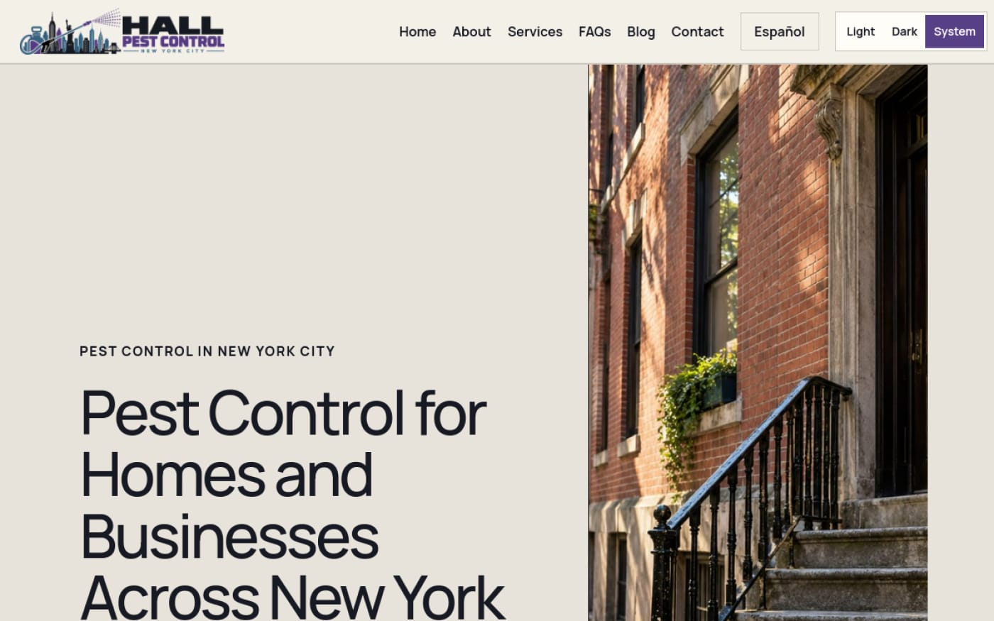
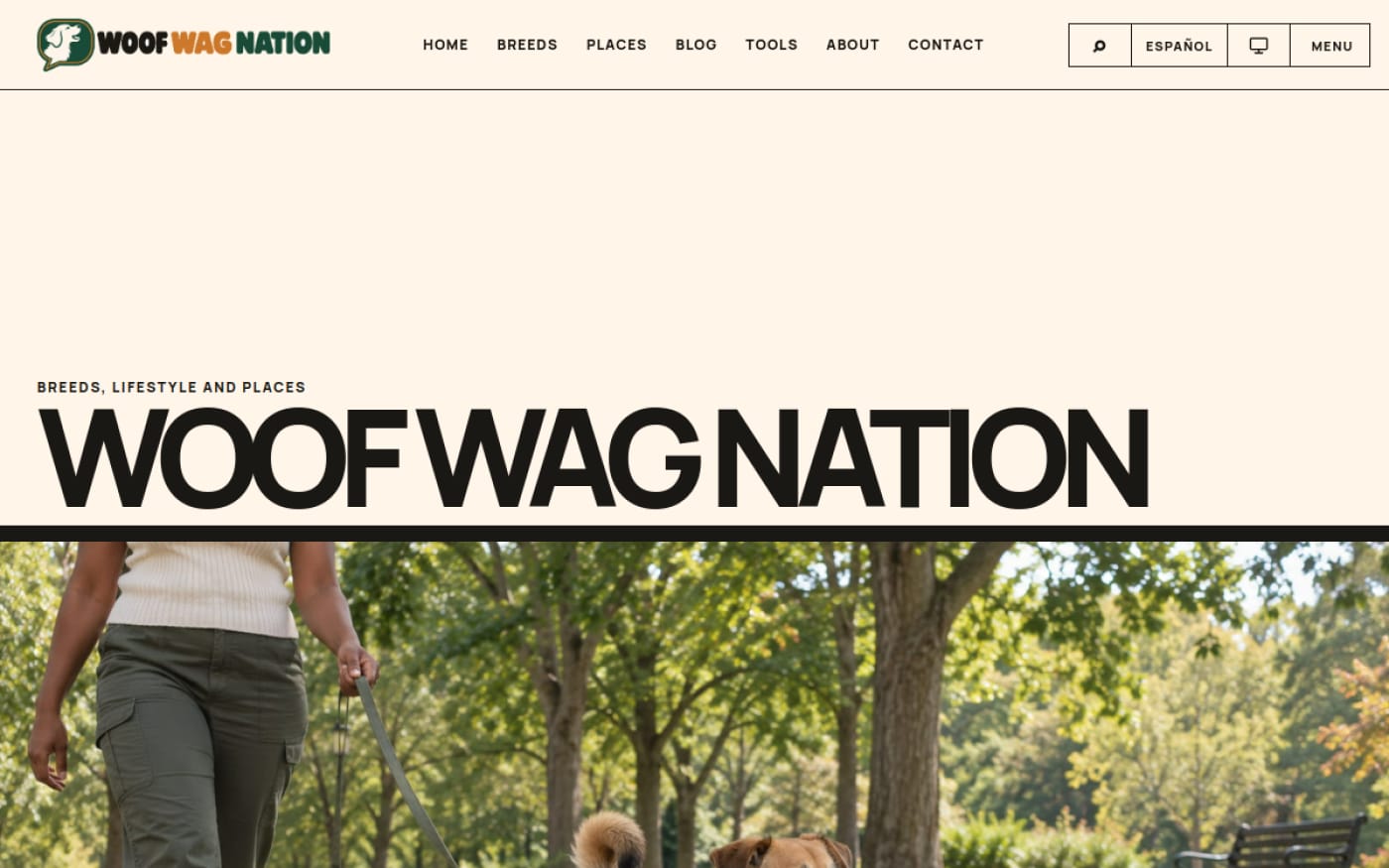
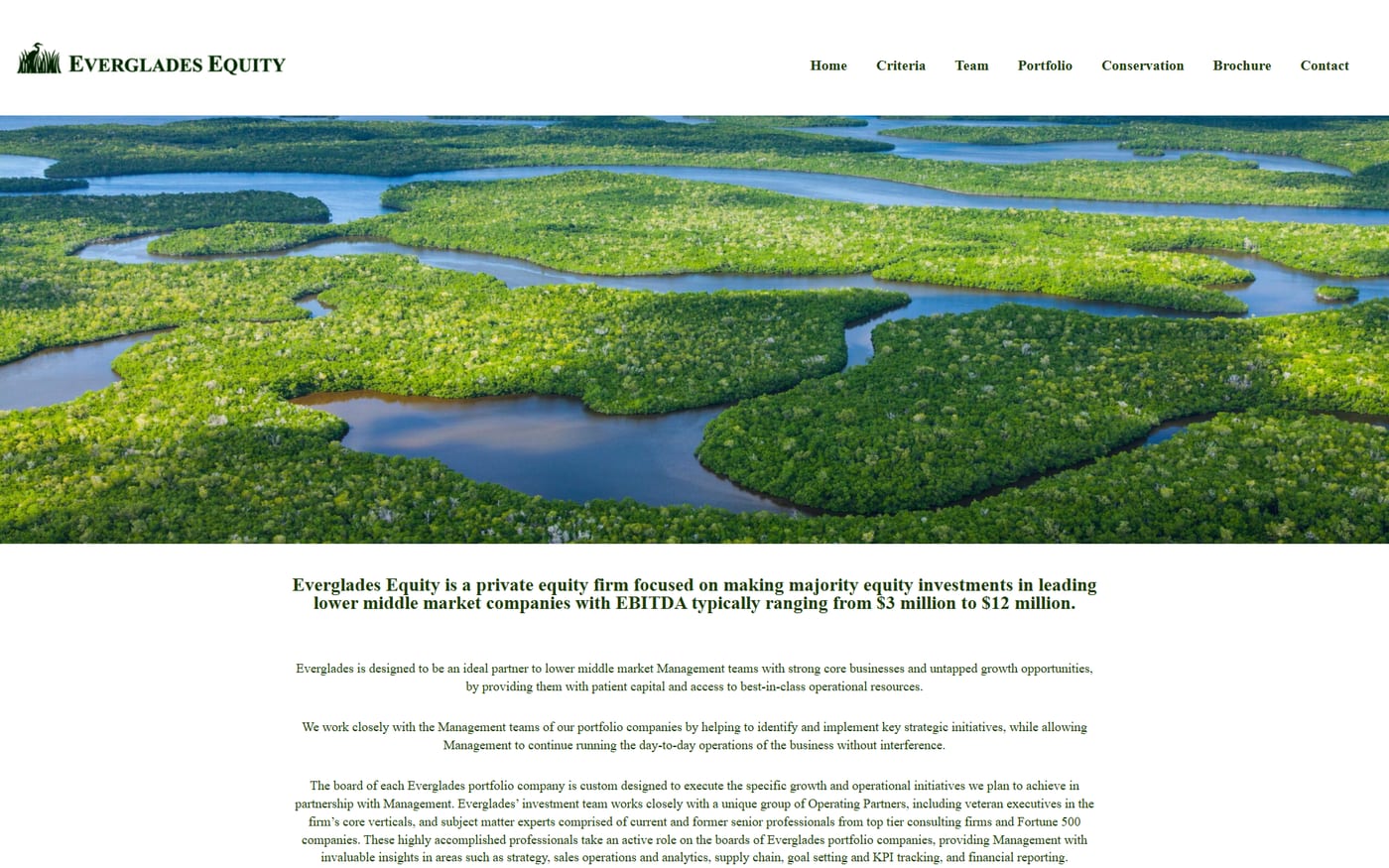
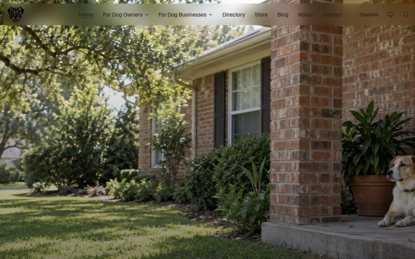
Your name in a row of open tabs, the way a buyer actually sees you.
First, the thing that's actually happening.
Here's the moment that decides most of your sales, and you never get to be in the room for it. A buyer has your name and two or three others. They open all of you in tabs. In about six seconds, before they read a word, they've already sorted you into "worth a call" or "close the tab." They're not judging your work yet. They can't. They're judging what you look like and what you sound like, side by side with everyone else.
Right now, in that lineup, most businesses look interchangeable. Same stock-photo hero. Same three adjectives. A logo that could belong to any of four competitors because it came from the same template gallery they all shopped in. You know your work is different. The problem is the buyer can't see that in six seconds, and six seconds is all you get.
Branding is the work of winning that moment. Not decorating you. Making you legible. When it's done, the comparison stops working against you: you're recognized on sight, you sound like you in every place a buyer meets you, and you read as the obvious choice instead of one of the tabs.
- A position: who you're for, what you do better, and why it matters, said in a sentence a stranger can repeat.
- A voice: the way you sound in writing, defined so every page, post, and email sounds like the same person.
- A visual system: color, type, spacing, imagery, and your mark, working as a set so anything you make looks like it came from you.
- Guidelines: the whole thing written down, so it holds together no matter who's building the next thing.
That's the object. The rest of this page is what each part is, how we build it, and the handover where all of it becomes yours.
You've been sold a logo and told it was a brand.
Here's the trap almost everyone falls into. You need a brand, so you buy a logo. A nice mark lands in your inbox, you put it in the corner of a template site, and you call it done. Then you wonder why nothing feels different, why you still blend in, why the site still looks like a competitor's with the colors swapped.
The logo isn't the problem. The idea that the logo is the brand is the problem. A logo is one part, and not the part doing most of the work. Your mark is a name tag. It tells people what you're called. It doesn't tell them who you are, why you're the right call, or what to expect when they hire you. That's the job of everything around it, and "everything around it" is what a template leaves blank.
Template identities make the same promise the logo myth does, at scale. You pick a look off a shelf, drop your name in, and inherit a design built for a demo business that doesn't exist. It's fast and it's cheap on day one. The cost comes later, every day, in the comparison you keep losing because you chose the same shelf as the people you're competing with. Looking like four competitors isn't a small aesthetic issue. It's the buyer having no reason to pick you.
“A logo tells people your name. A brand tells them why to pick you.”
Real branding runs the other way. It starts with what's true about your business, decides how to say it and show it, and builds a system that makes those decisions repeatable. The mark comes out of that, sized and shaped by it, instead of standing in for it. If you want the mark done right on its own, that's a service too: a logo built to be legible and yours in every format. But a mark without a position and a voice behind it is a name tag on an empty suit.
Say who you're for, or you're for no one.
Positioning is the least visible part of a brand and the part that decides everything else. It's the answer to a question your buyer is asking without saying it out loud: "Why you, and not one of the others?" If your answer is a list of everything you do for everyone, you've answered "no reason in particular," and the buyer moves on.
Most businesses avoid this on purpose, out of fear. Naming who you're for feels like turning away everyone else. It's the opposite. A position is a magnet, and a magnet needs a pole. When you say clearly who you're the right call for and why, the right buyers feel it and the wrong ones filter themselves out before they waste your time. Vague reads as weak. Specific reads as confident.
Getting there is research, not a brainstorm. We look at what you actually do best, who your best customers already are, what they typed to find you, and where your competitors are standing so we don't stand in the same spot. Out of that comes the thing you've been missing: a clear position, and a value proposition you can say in a sentence. Not a slogan. A true, plain statement of who you serve, what you do better, and why it matters, that a stranger could repeat to a friend without getting it wrong.
That sentence then does quiet work everywhere. It decides what the homepage says first. It decides which services lead. It decides the voice and even the visual mood, because "trusted and established" and "sharp and modern" don't look or sound the same. Positioning isn't a document you file away. It's the spine the rest of the brand hangs on, and it's why we settle it before we design a single thing.

You should sound like you everywhere.
Read three service businesses' websites back to back and they blur together, because they all write in the same voice: the careful, corporate, says-nothing voice people reach for when they're afraid of sounding wrong. It's safe, and safe is forgettable. Your buyer forgets it before they've finished the sentence.
Voice is how you sound in words, made consistent on purpose. Not a personality you put on. The way you'd actually explain your work to a smart friend who isn't in your industry, captured and made repeatable so it survives past the one page you were paying attention on. When your voice is defined, your homepage, your service pages, your emails, your social posts, and your proposals all sound like the same person talking. That consistency is recognition. People start to know you by how you sound before they've met you.
“Sound like everyone else and you're forgettable by default.”
We define it in plain terms your team can actually use: how formal or direct you are, the words you lean on and the ones you never say, how you open, how you handle a hard truth, how much you explain. Then we show it, not just describe it. Before-and-after rewrites of your own copy, so the difference is on the page instead of in the abstract. The goal is that anyone who writes for you, you, a staffer, a contractor, or us, produces the same voice without guessing.
Voice is also where a brand keeps its promises or breaks them. Say "friendly and human" and then write like a legal disclaimer, and the buyer feels the lie even if they can't name it. We make the voice match the position, so what you sound like and who you say you are line up. When you're ready to run that voice across the channels where buyers scroll, a social presence that actually sounds like you is where it earns its keep every week.
Recognizable, or just decorated.
This is the part people picture when they hear "branding," and it's real, as long as you understand it's a system and not a coat of paint. A visual system is the full set of decisions that make anything you produce look like it came from you: color, typography, spacing, imagery style, iconography, the way your mark is used, and how all of it behaves from a business card to a billboard to a phone screen.
The word doing the work is system. One nice color and one nice font aren't a brand; they're two nice choices. A system is those choices plus the rules for how they go together, so the fiftieth thing you make matches the first without anyone having to remember how. That's the difference between a business that looks put-together everywhere and one that looks slightly different in every place it appears, telling buyers it isn't quite in control of itself.
We build the visual system as an actual set of parts, the way we build everything: a color palette with defined roles, not just "the blue"; a type pairing chosen to be legible at the sizes people really read; spacing and layout patterns so pages feel like siblings; an imagery direction so your photos and illustrations belong to one family instead of clashing; and rules for the mark so it's never stretched, recolored, or crowded into something that isn't you. Because the web is where your brand lives most of the time, the system is designed to drop straight into a custom site built around your business, where a brand either holds together or falls apart in public.
One promise runs under all of it: you get the system in every format you'll ever need. Color values for screen and for print. The fonts, with their licensing sorted so you can use them without a surprise later. Your mark in every file type, at every size, in full color and in single color, for dark backgrounds and light. Not a folder of one PNG. A complete, usable kit, delivered so any designer, printer, or developer can pick it up and produce on-brand work the same day.
Four parts, in order. No mood boards, no mystery.
A brand built in the wrong order falls apart. Design the look before you've settled who you're for, and you're just decorating a guess. So, we work in the order the decisions actually depend on each other: position first, then voice, then the visual system that expresses both, then the guidelines that keep it all standing. You see and approve each part before we build the next one on top of it.
Positioning
We start with research, not a mood board. What you do best, who your best customers already are, what they search for, and where competitors are standing. Out of it comes your position and a value proposition you can say in one sentence. You approve that sentence before anything visual begins, because everything after it is built to serve it.
Voice
With the position settled, we define how you sound: how direct you are, the words you own and the ones you avoid, how you open and how you handle a hard truth. We prove it with before-and-after rewrites of your own copy, so the voice is on the page, not just described. You end up with rules your whole team can write to without guessing.
Visual system
Now the look, built to express the position and voice, not to chase a trend. Color with defined roles, a legible type pairing, spacing and layout patterns, an imagery direction, and the rules for your mark. Everything is checked at real sizes, in light and dark, at accessible contrast, so it holds up where buyers actually meet it.
Guidelines and handover
The whole system written down: how to use it, what never to do, and enough examples that the next person builds on-brand without asking. Then the handover. Every file, every format, the fonts and their licensing, your mark in every version, delivered into accounts and folders that are yours. The brand doesn't live in our heads. It lives in a kit you own.
1
A word on timeline and cost, because you're wondering. A focused brand runs a few weeks; a full rebuild with naming or deep research runs longer, and we tell you which one you need before you commit, sometimes talking you into the smaller one. Real work runs on real terms: a setup fee, a clear process, and commitments sized to the actual scope. What you'll never sign is a trap. Every number is in writing before we begin.

Ready when you are. Your work, actually yours.
Tell us about your business and what this needs to cause. You'll have a plan back within one business day, including when the answer is that you do not need this.
Tell us your casePosition, then voice, then visuals, then the written guide, built so each one holds up the next.
Asked and answered, before the call.
Isn't branding just a logo?
No, and this is the most expensive misunderstanding in the whole category. A logo identifies you; a brand positions you. You can own a beautiful mark and still lose the six-second comparison because there's no position, no voice, and no visual system behind it. We build the system; the logo comes out of it, sized and shaped to fit, rather than standing in for the whole thing.
Ask us about BrandingWhere does the brand kit fit into a website build?
At the very start, and it is the first thing your setup fee covers. Before we design a single page, we settle your brand kit: the position, the voice, and the visual system. Everything after is built to serve it, the site, the words, the way it all looks and sounds, which is why our builds read as one considered thing instead of a logo dropped onto a template. You do not have to learn the machinery behind it; you get a result that holds together because the brand came first, not last. If you only need the brand kit, we can do that as its own engagement too.
Talk Branding through with usWhat does it cost?
Honestly, it depends on scope, and we quote it flat before we start. A focused identity, positioning, voice, and a visual system with guidelines, is one number. A full rebuild that adds naming, deep research, or a large rollout is a larger one. Your setup fee covers the brand kit, the foundation the rest of the work is built on, the process is clear, every figure is in writing up front, and there's no hourly meter running in the background. We'll also tell you when you need the smaller engagement instead of the bigger one.
Get Branding priced for your businessHow long does it take?
A focused brand is usually a few weeks, not months. The honest variable is you: when decisions and feedback come back quickly, it moves quickly, because branding stalls on approvals, not on the work. A full rebrand with naming or extensive research gets a written timeline in the proposal, so you know the shape of it before anything starts.
Ask how long Branding takesDo I own the final files?
Yes, completely, and this is the part that is easy to stay quiet about. You get the whole system in every format you'll ever use: color values for screen and print, the fonts with licensing sorted, and your mark in every file type, size, and color version. It lands in accounts and folders that are yours from the start. If you ever part ways with us, everything leaves with you and any designer can keep building on it the same day.
Ask who owns what on BrandingShould I rebrand, or just refresh?
Often a refresh is the right call, and we'll say so even though it's the smaller job. If your position is still true and buyers still recognize you, we tighten the system rather than replace it, so you don't throw away recognition you've already earned. A full rebrand is for when the business has genuinely changed or the current identity is actively working against you. We help you tell the difference before you spend.
Ask if Branding is the right callWill a new brand confuse my existing customers?
Not if it's rolled out with intent. We plan the change so it reads as you growing up, not you becoming a stranger, and we can phase it across your site, social, and materials instead of flipping everything overnight. Handled well, a rebrand reintroduces you to the people who already know you and makes you legible to the ones who don't yet.
Ask how Branding fits what you haveA position, a voice, a visual system and a written guide, all of it yours in every format. Looking like everyone else costs you inside a comparison you never get to see, which is what makes it hard to notice. If you also want the plan for keeping that reputation clean once buyers start looking, a working reputation strategy pairs with this one. Tell us what's bothering you, and we'll reply within one business day.